Flying SVG planes
In the latest revamp of the Swiss Air website, they introduced an interesting loading animation. It involved a bunch of planes flying around some text:
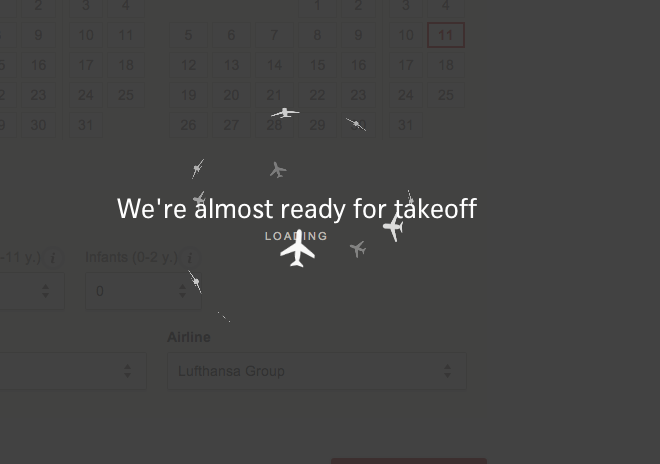
I thought it would be fun to implement that using SVG and CSS3 animation.
See the Pen Flying SVG+CSS3 planes by Utkarsh Upadhyay (@musically_ut) on CodePen.
Compatibility
Linux: Chrome 29.0 ✘ , Firefox 28.0 ✔ Mac OS: Chrome 34.0 ✔, Firefox 29.0 ✔
Getting started
First step was getting a plane on the screen. I wrote just one half of the plane in SVG and mirrored it to get the other half:
<svg viewBox="-5 -5 10 10" width="200" height="200">
	<path d="M 0,-5
             A 1,1 0 0 1 1,-4
             L 1,-1 5,1 5,2 1,1 1,3 2,4 2,5 0,4"></path>

	<path transform="scale(-1, 1)"
		  d="M 0,-5
             A 1,1 0 0 1 1,-4
             L1,-1 5,1 5,2 1,1 1,3 2,4 2,5 0,4"></path>
</svg>
See the Pen A single plane skeleton by Utkarsh Upadhyay (@musically_ut) on CodePen.
Improving the SVG for reuse
It is easy to see that there is a bit of repetition in there and SVG provides use and symbol tags just to take care of this repetition:
<svg width="300" height="300">
  <defs>
    <path id="svg-half-plane"
          d=" M 0,-5
              A 1,1 0 0 1 1,-4
              L 1,-1 5,1 5,2 1,1 1,3 2,4 2,5 0,4"
          ></path>

    <symbol viewBox="0 0 10 10" id="svg-plane" overflow="visible">
      <use xlink:href="#svg-half-plane"></use>
      <use xlink:href="#svg-half-plane" transform="scale(-1, 1)"></use>
    </g>
  </defs>
  <g>
    <use xlink:href="#svg-plane" x="100" y="100" width="50" height="50"></use>
  </g>
</svg>
This is more DRY and easier to reuse.
CSS3 animations + SVG
The basic animation is easy:
- Change the angle of rotation from
0degto360deg, and, - Change the opacity of the planes from
1to0.5to1.
So this should have been enough (modulo the browser prefixes):
@keyframes flyaround {
  0% {
      transform : rotateX(0deg) translateZ(140px);
      opacity   : 1.0;
  }

  50% {
      transform : rotateX(180deg) translateZ(140px);
      opacity   : 0.5;
  }

  100% {
      transform : rotateX(360deg) translateZ(140px);
      opacity   : 1.0;
  }
}
However
I had stepped into the dicey world of CSS3 animations mixed with SVG and had to put up with certain browser shenanigans.
It seems that Chrome 34.0.1847.131 on Mac does not support z axis movements on a use element while the containing g element has a perspective set on it. (Cannot find an official bug report for this, though.)
Hence, to simulate the nearing and furthering of planes, I had to introduce scale3d(0.5, 0.5, 0.5), but, thankfully, only for Chrome:
@keyframes flyaround {
  0% {
      transform  : rotateX(0deg) translateZ(140px) scale3d(1, 1, 1);
      opacity    : 1.0;
  }

  50% {
      /* This line is different for -webkit! */
      -webkit-transform : rotateX(180deg) translateZ(140px) scale3d(0.5, 0.5, 0.5);
      transform  : rotateX(180deg) translateZ(140px) scale3d(1, 1, 1);
      opacity    : 0.5;
  }

  100% {
      transform  : rotateX(360deg) translateZ(140px) scale3d(1, 1, 1);
      opacity    : 1.0;
  }
}
The problem with this, however, is that -webkit does not respect the z-ordering of the planes. Hence, sometimes, when the planes overlap each other with the one at the bottom appears to be on top.
This is one of the reasons that I chose to change the opacity (instead of the fill) and scale of the plane further away so that the erroneous overlapping becomes less noticeable. However, when we put some text at z=0, the Webkit version is no longer going to work with the text either always atop other planes or below them.
Firefox, on the other hand, handles z indexes without any problem.
See the Pen Flying SVG+CSS3 planes by Utkarsh Upadhyay (@musically_ut) on CodePen.